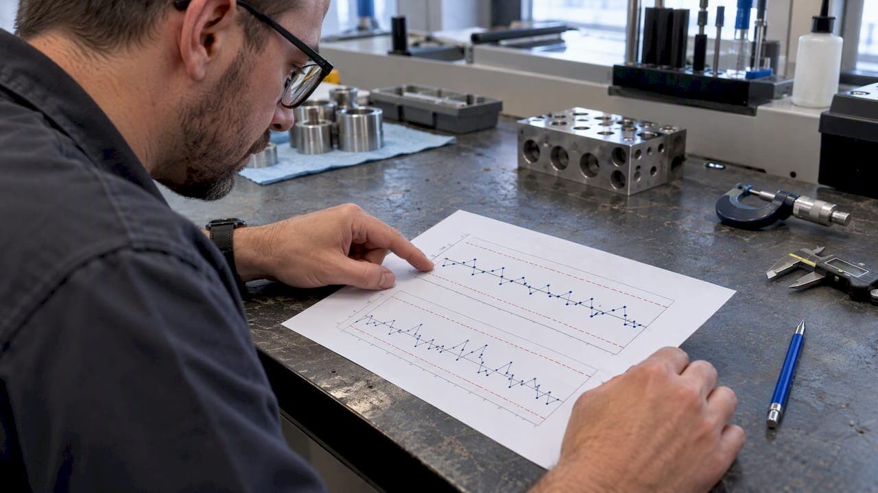
An Xbar-R chart pairs a chart of subgroup means (X̄) with a chart of subgroup ranges (R) to monitor process central tendency and short-term variation at the same time. We recommend it when you can form rational subgroups of typical size 2 to 8, with control limits built from the grand mean and average range using standard control constants, and with the R chart inspected first.
TL;DR:
- Use Xbar S at nine or more; individual moving range charts suit single readings, while attribute charts suit binary outcomes or defect counts.
- Keep subgroup makeup consistent across the same machine, operator, and setup; if sample sizes vary, use Xbar S with pooled standard deviation instead of range constants.
- If the R chart signals instability, investigate subgroup consistency, gauge drift, and recent process changes before classifying the signal as a special cause.
- Start with Tests 1 and 2, then add others only after trusting the limits; running tests on both charts raises false alarm risk.
Table of Contents
- What an Xbar-R chart is and when to use it
- When to use the R chart vs the S chart
- How to calculate and construct Xbar-R charts
- Interpreting Xbar and R charts: which tests apply where
- Data collection and rational subgrouping best practices
- Worked example and practical walkthrough
- How QA-Report supports Xbar-R workflows and audit-ready reporting
- Practical notes and priorities for reliable control-charting
- QA-Report: capture, analyze, and report Xbar-R data in one place
- FAQ
- Sources
What an Xbar-R chart is and when to use it
The X̄ chart tracks the average of each subgroup over time, showing whether the process center is shifting. The R chart tracks the spread within each subgroup, showing whether variation is stable. We pair them because a shift in the mean means little if the underlying spread is also moving, and vice versa; together they give a fuller picture of process behavior than either chart alone.
In practice, Xbar-R charts fit situations with continuous measurements and small, frequent subgroups, such as:
- Dimensional checks on machined parts pulled in groups of 4 or 5 per shift.
- Short-run production where a new setup needs quick confirmation of stability.
- Shift-based or hourly sampling plans common in CNC machining and injection molding.
Not every process calls for Xbar-R. When subgroup size climbs to 9 or more, Minitab's guidance points to Xbar-S instead, since the standard deviation becomes a more efficient estimator at larger sample sizes. For individual, unsubgrouped readings, such as one measurement per lot or per batch, an I-MR chart is the better tool. For pass/fail or defect-count data, attribute charts like p-charts or c-charts apply instead of a variables chart altogether.
When to use the R chart vs the S chart
Subgroup size is the deciding factor, not personal preference. Minitab's documentation recommends the R chart for subgroup sizes of 8 or fewer, and the S chart once subgroups reach 9 or more.
The range estimator remains highly efficient at small subgroup sizes, maintaining near maximal precision at n=2 and retaining strong efficiency up to around n=5, according to MoreSteam's practitioner guidance. That efficiency is why the range chart remains the practical default for the small, frequent subgroups common in machining and assembly work, even though the standard deviation is technically a more complete measure of dispersion.
The practical takeaway: when your subgroup size changes, your chart type and constants need to change with it. Mixing R-chart constants into a dataset collected at n=9 or larger produces limits that no longer reflect the actual estimator being used.

How to calculate and construct Xbar-R charts
Building an Xbar-R chart by hand, or verifying what your software produced, comes down to five calculations performed in sequence.
For each subgroup i:
- X̄ᵢ, the subgroup average: sum the measurements in the subgroup and divide by the subgroup size, n.
- Rᵢ, the subgroup range: subtract the smallest value in the subgroup from the largest.
Across all k subgroups:
- X̄̄ (the grand mean): average all the X̄ᵢ values together.
- R̄ (the average range): average all the Rᵢ values together.
The control limits follow directly from those two grand statistics, using factors drawn from the NIST/ITL Engineering Statistics Handbook:
X̄ chart: UCL = X̄̄ + A2 × R̄ LCL = X̄̄ − A2 × R̄
R chart: UCL = D4 × R̄ LCL = D3 × R̄
The constants A2, D3, and D4 depend entirely on subgroup size, and d2 is used separately to estimate the process standard deviation from the average range. Here is the standard table for subgroup sizes 2 through 10:
| n | A2 | d2 | D3 | D4 |
|---|---|---|---|---|
| 2 | 1.880 | 1.128 | 0 | 3.267 |
| 3 | 1.023 | 1.693 | 0 | 2.574 |
| 4 | 0.729 | 2.059 | 0 | 2.282 |
| 5 | 0.577 | 2.326 | 0 | 2.114 |
| 6 | 0.483 | 2.534 | 0 | 2.004 |
| 7 | 0.419 | 2.704 | 0.076 | 1.924 |
| 8 | 0.373 | 2.847 | 0.136 | 1.864 |
| 9 | 0.337 | 2.970 | 0.184 | 1.816 |
| 10 | 0.308 | 3.078 | 0.223 | 1.777 |
Notice that D3 is zero for subgroup sizes through 6, which is why the R chart's lower control limit sits at zero for those common subgroup sizes rather than taking on a negative value, a result that would be meaningless for a range.
A few practices matter once the numbers are in hand. Minitab's worked example notes that initial control limits can be calculated after several subgroups, with the estimate stabilizing after more subgroups. Recalculate limits once a process has run long enough to represent its typical behavior, and again after any deliberate process change. The constants in the table above assume a constant subgroup size throughout the dataset; if your sampling plan produces subgroups of varying size, these range-based constants no longer apply uniformly, a point covered further below.

Interpreting Xbar and R charts: which tests apply where
Read the R chart before the X̄ chart. If the range chart is out of control, the process variation is unstable, and the control limits calculated for the X̄ chart (which depend on R̄) cannot be trusted. Stabilize the spread first.
Minitab's documentation on special-cause tests outlines eight Western Electric/zone tests for detecting non-random patterns, but not all of them are meaningful on an R chart. Tests 1 through 4, covering points beyond the control limits, runs on one side of the center line, trends, and alternating patterns, are the ones that typically apply to the range portion. Applying every test to both charts simultaneously increases the odds of a false alarm; Test 7, in particular, is prone to flagging stable processes as out of control when used indiscriminately.
When a signal does appear, work through it in order:
- Confirm the subgrouping is still rational: same machine, operator, and setup within each subgroup.
- Check the measurement system itself before suspecting the process; a drifting gauge can mimic a process shift. Our Gage R&R guide walks through how to rule this out.
- Review recent process changes: tooling swaps, material lots, or shift transitions near the signal's timestamp.
- Only after ruling out the above, treat the signal as a genuine special cause and begin corrective action.
Pro Tip: Start with just Tests 1 and 2 when a chart is new; add the remaining tests only after you trust your baseline limits.
Data collection and rational subgrouping best practices
Rational subgrouping is the principle that each subgroup should capture only the variation you want to monitor, grouping measurements taken close together in time, from the same machine, operator, and setup, so that differences between subgroups reflect real process shifts rather than noise within a subgroup.
A few rules keep subgrouping sound:
- Pick a subgroup size that balances sensitivity and practicality; n = 4 or 5 is a common starting point for dimensional checks.
- Sample often enough to catch drift before it produces scrap, but not so often that traceability and documentation become a burden on the floor.
- Keep subgroup composition consistent: same shift, same fixture, same gauge, every time.
- When subgroup size genuinely varies between samples, Minitab's data considerations guidance recommends moving to Xbar-S with pooled standard deviation rather than forcing range constants onto mismatched subgroup sizes.
Worked example and practical walkthrough
Say five subgroups of n = 4 parts each produce the following subgroup averages and ranges: X̄ᵢ of 10.02, 9.98, 10.05, 9.95, and 10.01 millimeters, with ranges of 0.08, 0.10, 0.06, 0.09, and 0.07 millimeters.
The grand mean, X̄̄, averages to 10.002 millimeters. The average range, R̄, averages to 0.08 millimeters. Using A2 = 0.729 for n = 4, the X̄ chart limits become UCL = 10.002 + (0.729 × 0.08) = 10.060 and LCL = 10.002 − (0.729 × 0.08) = 9.944. Using D4 = 2.282 and D3 = 0 for n = 4, the R chart limits become UCL = 2.282 × 0.08 = 0.183 and LCL = 0.
Illustrative example: all five subgroup averages and ranges fall within these limits, consistent with a stable process over this short run.
To build this in Excel:
- List each subgroup's raw measurements, then use AVERAGE and MAX minus MIN formulas to compute X̄ᵢ and Rᵢ for each row.
- Average those columns to get X̄̄ and R̄.
- Look up A2, D3, and D4 for your subgroup size from the table above and compute the four limit values.
- Plot X̄ᵢ and Rᵢ as line charts, then add horizontal lines for UCL, center line, and LCL on each.
In Minitab, the path is Stat > Control Charts > Variables Charts for Subgroups > Xbar-R, where you specify your data columns or subgroup size, then enable the special-cause tests under the Tests tab.
If your chart output looks off, check three things first: whether subgroups were entered with a consistent size, whether the constant lookup matches that size, and whether the R chart's LCL is correctly showing zero rather than a stray negative value.
How QA-Report supports Xbar-R workflows and audit-ready reporting
Collecting clean subgroup data is most of the battle, and it is where manual transcription tends to introduce the errors that corrupt a chart before the math ever starts. Within our platform, we built several features specifically to close that gap:
- Automatic drawing ballooning that links each measured dimension to its drawing callout, reducing mismatched or mislabeled readings.
- CMM data import that pulls coordinate-measuring machine output directly into subgroup records without manual retyping.
- Tolerance validation that flags out-of-tolerance values automatically as they arrive.
- Statistical summaries and PDF reports generated from the same measurement data, cutting the lag between a signal appearing and an investigation starting.
Engineers evaluating an integrated approach can review our feature overview for how capture and reporting connect in one workflow.
Practical notes and priorities for reliable control-charting
In our view, the chart itself is the easy part. The decisions that actually determine whether an Xbar-R chart tells the truth happen before the first point is plotted: rational subgrouping, a measurement system you trust, and a documented sampling plan you do not quietly change mid-stream.
Resist the urge to run every special-cause test from day one. Establish limits, confirm them against a hand calculation, and only then add sensitivity. Replicate a worked example like the one above against your own software output before trusting it on production data.
— Michael Chen
QA-Report: capture, analyze, and report Xbar-R data in one place
We built our platform so that quality engineers running Xbar-R charts on the shop floor are not also stuck reconciling spreadsheets after the fact. Capturing subgroup measurements through our measurement wizard, with automatic ballooning and CMM import feeding straight into tolerance checks, means the data behind your chart is already clean by the time you calculate limits.

What that looks like in daily use:
- Ballooned drawings and CMM import remove manual retyping of subgroup values.
- Automated statistical summaries sit alongside audit-ready PDF reports for regulatory and quality system reviews.
- Role-based mobile access lets inspectors log readings from the floor as subgroups are collected, not hours later.
If an integrated workflow sounds useful for your team, our pricing page outlines the Free, Basic, and PRO tiers, along with On-Premise and Enterprise Solutions for teams with stricter data requirements.
FAQ
What is the difference between Xbar-S and Xbar-R charts?
Both charts monitor process mean and variation, but Xbar-R uses the subgroup range while Xbar-S uses the subgroup standard deviation to track spread. Minitab recommends Xbar-R for subgroup sizes of 8 or less and Xbar-S for subgroup sizes of 9 or more, since the standard deviation becomes the more efficient estimator at larger sample sizes.
How do I create an Xbar-R chart in Excel?
Calculate each subgroup's average and range using AVERAGE and MAX minus MIN formulas, then average those columns to get the grand mean and average range. Look up the A2, D3, and D4 constants for your subgroup size, compute the four control limits, and plot both series as line charts with horizontal limit lines added.
How do you calculate an Xbar-R chart?
Compute each subgroup mean (X̄ᵢ) and range (Rᵢ), then average those values across all subgroups to get the grand mean (X̄̄) and average range (R̄). Apply the standard control constants A2, D3, and D4 for your subgroup size to get UCL and LCL for both the X̄ and R charts.
How do I make an R chart?
Calculate the range for each subgroup by subtracting the smallest value from the largest, then average those ranges to get R̄. Multiply R̄ by D4 for the upper control limit and by D3 for the lower control limit, noting that D3 is zero for subgroup sizes through 6, which places the lower limit at zero.
Why should I check the R chart before the X̄ chart?
The X̄ chart's control limits are calculated using the average range, so an unstable R chart means those limits cannot be trusted. Stabilizing variation first, often starting with a measurement system check, gives you a sound basis before interpreting shifts in the mean.
Sources
For derivations of the Xbar-R formulas and full factor tables, the NIST/ITL Engineering Statistics Handbook remains the primary technical reference. Minitab's support library covers chart selection guidance and special-cause testing in detail, and before trusting any chart's signals, confirming your gauges are properly calibrated is worth the time; PCS Precision's calibration guidance covers why that step protects the integrity of everything downstream.