
Seven metrics separate quality programs that drive results from ones that generate reports nobody reads: first pass yield (FPY), DPMO/PPM with sigma level, Cpk, scrap and rework rate, cost of poor quality (COPQ), the quality component of OEE, and customer or warranty return rate. Together they capture three things at once: how your process performs today, how many defects escape to the next station or the customer, and what those failures cost the business. The rest of this guide gives you the formulas, realistic benchmark ranges, dashboard design, and the data plumbing to make these numbers trustworthy.
TL;DR:
- Moving from a defect count to a normalized DPMO below 100 shifts benchmarking from confusion to clarity, emphasizing consistent opportunity definitions.
- Improving station FPY by 3 to 6 points in 90 days through error-proofing is realistic, while achieving a two-sigma level increase in that period is unlikely without process redesign.
- Building KPI definitions and data sources into a single documented standard prevents metric drift and inconsistent reporting, which are frequent causes of false improvement signals.
- Starting small with one operational and one business KPI and ensuring each has an owner and decision rule accelerates initial progress and sustains focus.
Table of Contents
- What Quality KPIs Are and How to Use Them
- Core Quality KPIs: Definitions, Formulas, and Use Cases
- Benchmarks and What Good Looks Like
- How to Choose the Right KPI Set and Build a Hierarchy
- Data and Measurement: Keeping KPI Calculations Consistent
- From KPI to Action: Dashboards, SPC, and PDCA
- How a QA-Focused Inspection Platform Supports KPI Workflows
- Case Studies: Quality KPIs in Practice
- First 90 Days: What I'd Prioritize as a Quality Manager
- Get Inspection Data Flowing Into Your KPI Dashboard
- Sources
What Quality KPIs Are and How to Use Them
A metric is any number you can measure. A KPI is a metric someone has agreed to act on. That distinction matters more than it sounds, because plenty of quality departments track forty numbers and act on none of them. A true quality KPI has an owner, a target, and a documented decision that changes when the number crosses a threshold.
Every KPI falls into one of two buckets: leading or lagging. Leading indicators tell you a problem is forming before it reaches the customer. Process capability (Cpk) and statistical process control (SPC) signals are the classic examples. If Cpk on a critical dimension drifts from 1.5 to 1.2, you have a warning weeks before scrap rates climb. Lagging indicators tell you what already happened. Scrap rate, warranty returns, and customer complaints are lagging by definition. They confirm damage rather than prevent it.
Neither category works alone. A manufacturing quality metrics practitioner's guide makes the case plainly: process signals only earn budget and attention when someone ties them to a business outcome like warranty cost or customer complaints. A Cpk chart that never connects to a dollar figure gets ignored in the next budget cycle.
That's why first pass yield functions as the anchor metric for most quality programs. FPY tells you what percentage of units clear a station or the full line without any rework, repair, or scrap, and it rolls up cleanly into both leading and lagging conversations. A drop in FPY is often the first visible symptom of a capability problem that hasn't yet shown up in a Cpk report.
Here's how the roles typically split by KPI type and use case:
- Leading indicators (Cpk, Ppk, SPC control-chart signals): monitored continuously by operators and engineers to catch drift before parts fail.
- Lagging indicators (scrap rate, rework rate, customer complaints, warranty returns): reviewed by supervisors and managers to confirm whether corrective actions worked.
- Bridge metrics (FPY, DPMO/PPM): sit between the two, updated frequently enough to act on but stable enough to trend over weeks.
- Financial metrics (COPQ): reviewed monthly or quarterly by plant management and finance to justify capital or staffing decisions.
The practical takeaway: build your KPI set so at least one leading indicator predicts at least one lagging indicator you already report to customers or executives. If you can't draw that line, you likely have a dashboard, not a quality management system.
Core Quality KPIs: Definitions, Formulas, and Use Cases
Every metric below answers a specific question. Get the formula wrong and the number becomes noise, so treat this as your reference sheet.
First Pass Yield (FPY) / First Time Quality (FTQ)
FPY measures the percentage of units that pass a station or process on the first attempt, with no rework, adjustment, or repair.
Formula: FPY = (Units entering the process − Units requiring rework or scrap) ÷ Units entering the process × 100
Measure FPY at each station, not just at final inspection. The MFG Calcs benchmark guidance notes that the gap between a station's reported yield and its true first pass yield is often the hidden rework tax nobody budgets for. Trend it weekly per station so a slow slide doesn't get buried in a monthly average.
Rolled Throughput Yield (RTY)
RTY multiplies the FPY of every station in a sequence, rather than averaging them.
DPMO, PPM, and Sigma Level
Defects per million opportunities (DPMO) normalizes defect counts so you can compare products with wildly different complexity.
Formula: DPMO = (Number of defects ÷ (Units × Opportunities per unit)) × 1,000,000
The opportunity count is where most teams go wrong. A printed circuit board with 200 solder joints has a vastly different opportunity count than a single stamped bracket, and comparing raw defect counts across the two tells you nothing. MFG Calcs recommends fixing and documenting your opportunity definition per part family so comparisons stay honest over time. Parts per million (PPM) is the simpler cousin, counting defective units rather than defect opportunities, and sigma level is just DPMO translated onto the six sigma scale for cross-plant benchmarking.
Scrap, Rejection, and Rework Rate
These three get used interchangeably, but they measure different things:
- Scrap rate: units that cannot be recovered and are discarded, calculated as scrapped units ÷ total units produced.
- Rejection rate: units failing inspection at any point, whether or not they can later be reworked.
- Rework rate: units that failed inspection but were successfully corrected and returned to the process.
Rework rate deserves particular attention because it hides capacity loss. A part that gets reworked twice before passing still counts as a "good" unit in a naive yield calculation, even though it consumed triple the labor and machine time.
Process Capability: Cpk and Ppk
Cpk measures how well a stable process fits within specification limits, accounting for both spread and centering. Ppk does the same calculation using long-term data rather than short-term subgroup data. A side-by-side breakdown of Cpk versus Ppk explains when quality engineers should report each one on a PPAP submission.
Formula: Cpk = minimum of [(USL − mean) ÷ 3σ, (mean − LSL) ÷ 3σ]
A Cpk below 1.33 signals elevated defect risk and should be stabilized before you invest in any other improvement, according to Netsuite's manufacturing KPI catalog. Below 1.0, the process is producing defects even when perfectly centered.
Cost of Poor Quality (COPQ)
COPQ adds up four categories: prevention costs, appraisal costs, internal failure costs (scrap, rework), and external failure costs (warranty, returns, field service).
Basic example: A plant scraps $40,000 in material monthly, spends $25,000 on rework labor, pays $60,000 in warranty claims, and spends $15,000 on inspection and calibration. That's $140,000 in monthly COPQ. Finance leadership cares about this number more than any other quality metric because it converts abstract process talk into a line item they already track.
Customer Complaints, Warranty Claims, and RMA Rate
Measure these against the specific ship cohort that generated them, not against total shipments in the reporting month. A warranty claim filed in March against a unit shipped in November tells you about November's process, not March's. Align your denominator to the shipment date, not the claim date, or your trend lines will lie to you.
OEE's Quality Component
Overall Equipment Effectiveness breaks into three factors: Availability × Performance × Quality. The quality factor is essentially FPY for that piece of equipment. The common mistake is double-counting: if a defect gets flagged in both the OEE quality factor and a separate scrap-rate report, teams can end up chasing the same root cause through two different dashboards without realizing it's one problem.
| KPI | Formula (short form) | Typical use case |
|---|---|---|
| FPY | Good units ÷ units entering process | Station-level yield tracking |
| RTY | Product of all station FPY values | End-to-end line performance |
| DPMO | Defects ÷ (units × opportunities) × 1,000,000 | Cross-product defect comparison |
| Cpk | Min[(USL−mean), (mean−LSL)] ÷ 3σ | Process stability and capability |
| COPQ | Prevention + appraisal + internal failure + external failure costs | Financial impact of quality |
| OEE quality factor | Good units ÷ total units produced | Equipment-level performance |
Benchmarks and What Good Looks Like
Numbers without context invite either complacency or panic, so here's where most plants actually sit versus where the best ones operate.
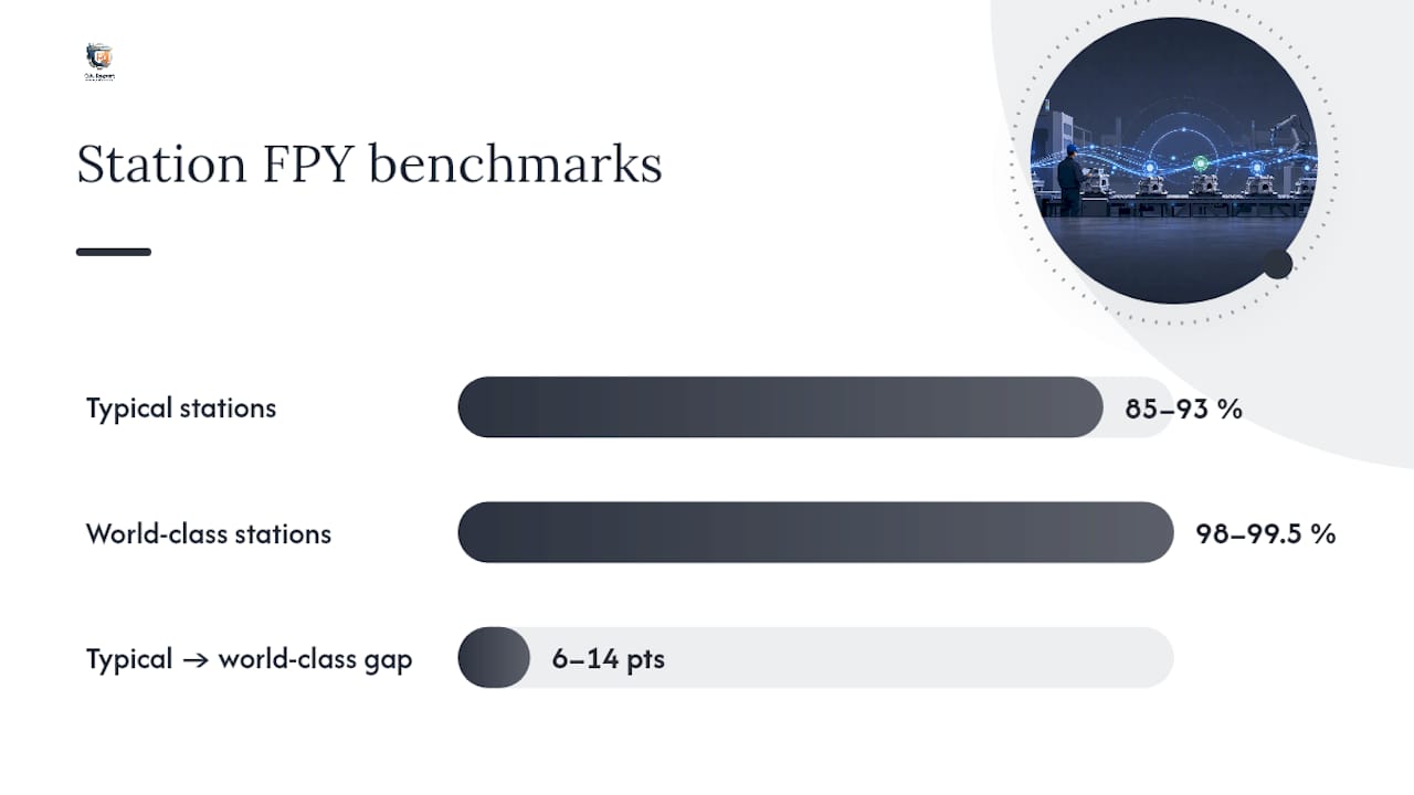
According to MFG Calcs' benchmark data, typical discrete manufacturing FPY per station runs 85% to 93%, while world-class stations hit 98% to 99.5%. That six-to-fourteen point gap is exactly where most improvement budgets should go first, because it compounds across every station in an RTY calculation.
DPMO tells a similar story at a different scale:
- Typical manufacturing: 3,000 to 25,000 DPMO
- Strong operations: 200 to 1,500 DPMO
- World-class: under 100 DPMO
Statistic Callout: Moving from typical (3,000 to 25,000 DPMO) to world-class (under 100 DPMO) isn't a single project. It's the cumulative effect of dozens of station-level Cpk improvements, each targeting one dominant failure mode at a time.
COPQ ranges tell you how much room for improvement usually exists in the budget itself: typical plants run COPQ at 15% to 25% of revenue, disciplined operations bring it down to 5% to 8%, and world-class plants hold it below 5%.
Target-setting should follow two horizons, not one:
- 90-day operational targets: station-level FPY lifts, error-proofing fixes, and Cpk stabilization on your worst-performing critical dimension.
- 12-month business targets: COPQ percentage reduction, warranty rate reduction, and sigma-level movement across a product family.
A realistic 90-day lever is improving station FPY by 3 to 6 points through error-proofing, a range MFG Calcs cites as common when teams focus fixture design and operator training on one dominant defect mode. Jumping two full sigma levels in a quarter almost never happens without a fundamental process redesign, and setting that as a target usually just teaches the floor to distrust the target-setting process. Decompose big goals into station-level wins instead. A 12-month sigma-level improvement is really twelve or more small Cpk wins stacked in sequence.
How to Choose the Right KPI Set and Build a Hierarchy
Start smaller than feels comfortable. One operational KPI (usually FPY at your worst station) and one business KPI (usually COPQ or warranty rate) is enough to launch a program. Add a third metric only once the first two have a named owner and a documented decision rule attached to them.
Run every candidate metric through this checklist before it earns a spot on a dashboard:
- Measurable: Can it be calculated consistently from existing data without a manual spreadsheet reconciliation every week?
- Actionable: Does a specific role change behavior when the number moves?
- Owned: Does one named person, not a department, answer for this metric?
- Comparable: Can this quarter's number be compared honestly to last quarter's, with the same opportunity count and denominator?
- Aligned to cost or risk: Does this metric trace to COPQ, warranty exposure, or a regulatory requirement?
Cadence should follow the role, not the other way around. Operators need real-time station FPY and SPC alarms they can react to within the hour. Supervisors need shift-level rollups and Pareto charts of the week's top defect codes. Managers need monthly and quarterly trends: COPQ, Cpk summaries, and sigma-level movement tied to business review.
Pro Tip: Assign one KPI per meeting, not five. A weekly quality review that tries to cover FPY, DPMO, COPQ, warranty, and Cpk in thirty minutes ends up doing none of them justice. Rotate the deep dive and keep the rest as a one-line status check.
The most common pitfalls all trace back to the same root cause: nobody wrote the definition down. Definition drift happens when one shift counts a reworked unit as "passed" and another counts it as "rejected then recovered." Disconnected systems happen when MES reports one scrap number and the QMS reports another for the same week. Too many KPIs happens when every department adds its favorite metric to a shared dashboard until nobody can find the three numbers that actually matter. The fix for all three is the same document: a single versioned KPI definition sheet that every system and every shift references.
Data and Measurement: Keeping KPI Calculations Consistent
KPI numbers are only as good as the systems feeding them, and most quality programs pull from five sources that rarely agree with each other by default.
Your MES (manufacturing execution system) captures real-time production counts, station-level pass/fail data, and cycle times. Your QMS (quality management system) holds inspection records, nonconformance reports, and CAPA history. SPC software tracks the control-chart data behind Cpk and Ppk. CMM systems generate the dimensional measurement data that feeds capability studies. ERP ties production orders to cost and shipment data, and your warranty or CRM system captures the field failures that complete the loop back to design and process.
Each system speaks its own language about what counts as a "unit," a "defect," or an "opportunity." That mismatch is where most KPI programs quietly fail:
- Fix your opportunity count per part family and document it once, rather than letting each engineer define it independently for a new DPMO calculation.
- Align timestamps across systems so a defect logged in MES at 2:14 PM matches the same event in the QMS, not a rounded shift total.
- Maintain lot genealogy so a field failure can be traced back to the specific batch, operator, and inspection record that produced it.
- Reconcile internal failure data against field failure data monthly. A part that passes every internal gate but fails in the field points to a gap in your test coverage, not a fluke.
Governance matters more than most quality managers want to admit. Version your KPI definitions the same way you version a drawing. When someone changes what counts as a "critical" defect, log it with a date and a reason, because a metric that silently changes definition mid-year makes every trend chart after that date meaningless. Practices like inspection documentation standards exist for exactly this reason: an auditable trail protects both your KPI integrity and your compliance posture at the same time.
From KPI to Action: Dashboards, SPC, and PDCA
A KPI that never triggers a decision is just a number on a screen. The path from measurement to action runs through three layers of visibility and one disciplined improvement cycle.
Dashboard design should mirror the role hierarchy discussed earlier. Guidance from RMDB's manufacturing dashboard framework recommends shop-floor screens showing real-time FPY and SPC control charts for operators, shift-summary Pareto charts of top defect codes for supervisors, and rolling 13-week trends of COPQ and Cpk for management review. Keeping the primary dashboard limited to five to eight metrics, per that same guidance, prevents the attention dilution that happens when every stakeholder's favorite number gets added to one screen.
SPC control limits exist to answer one question: is this variation normal, or does it need a person to look at it? A single point outside the control limit warrants a look. A run of seven points trending in one direction, even inside the limits, warrants escalation to a formal CAPA (corrective and preventive action) before the process drifts out of specification entirely.
A PDCA (Plan, Do, Check, Act) cycle applied to FPY improvement typically runs like this:
- Plan: Pull the Pareto chart for your worst-performing station and identify the single dominant defect mode.
- Do: Implement one fixture change, one training update, or one error-proofing device targeting that specific mode.
- Check: Trend station FPY weekly for four to six weeks and confirm the shift is real, not sampling noise.
- Act: Standardize the fix across identical stations or lines, then move to the next-highest defect mode on the Pareto chart.
When several corrective actions compete for the same engineering hours, prioritize by expected COPQ reduction multiplied by your confidence in the fix actually working. A high-cost defect with a well-understood root cause beats a cheaper defect with an uncertain fix, every time.
How a QA-Focused Inspection Platform Supports KPI Workflows
Getting accurate FPY and RTY numbers depends on how fast and how consistently inspection data gets captured at each station, and that's where most manual paper-based systems lose the war before it starts.
A measurement wizard links ballooned drawing dimensions directly to measured results, which removes one of the biggest sources of manual error in FPY tracking: mistyped or mismatched dimension IDs between the drawing and the inspection sheet. Automatic drawing ballooning and a built-in 3D CAD viewer for STEP and IGES files cut the setup time that normally delays first article inspection, so stations spend more time measuring and less time preparing paperwork.
A few specific capabilities map directly onto the metrics covered here:
- CMM data import feeds dimensional results straight into capability calculations, reducing the manual transcription errors that quietly distort Cpk and Ppk figures.
- Out-of-tolerance auto-flagging catches deviations at the point of measurement, which shortens the lag between a defect occurring and someone acting on it.
- MES-layer route cards and rejection tracking capture rework events at the station level, the same data RTY calculations depend on to avoid overstating yield.
- Audit-ready FAI and GD&T reports satisfying ISO 9001, AS9100, and PPAP requirements support the traceability an auditor expects to see behind every capability study.
None of this replaces the discipline of defining your KPIs correctly in the first place. It just removes the friction that keeps quality teams from measuring consistently enough to trust the numbers they already agreed to track.
Case Studies: Quality KPIs in Practice
The pattern across well-run quality programs is consistent even when the products aren't: teams that connect one leading indicator to one business outcome, then expand deliberately, tend to outperform teams that launch a twenty-metric dashboard on day one.
The gap existed because rework was happening quietly between stations and getting counted as first-pass success. Once the line began measuring FPY at each individual station rather than only at final test, the true rework tax became visible, and the RTY calculation across five stations dropped from an assumed 95% down to roughly 82%, a gap entirely consistent with how compounding station losses behave in documented benchmark analysis.
A separate pattern shows up around DPMO comparisons. Plants that switched from raw defect counts to a properly normalized DPMO figure, with a fixed and documented opportunity count per part family, found they could finally compare a complex circuit board assembly against a simple stamped part on equal footing. That single change turned defect reporting from a source of departmental arguments into a genuine improvement tool, because everyone finally agreed on what an "opportunity" meant.
The common thread: the metric itself rarely causes the improvement. Fixing how consistently it's measured does.
First 90 Days: What I'd Prioritize as a Quality Manager
Start with three numbers, not thirty. Get station-level FPY on your worst line, one Cpk reading on your most critical dimension, and a rough COPQ baseline built from whatever scrap, rework, and warranty data you can pull this week, even if it's imperfect.
Pilot on one product family and one line before expanding anywhere else. Lock your metric definitions in writing before the first weekly review, because renegotiating what "defect" means three weeks into a pilot kills momentum faster than a bad number does.
The cultural piece gets underweighted constantly. Make the data visible on the floor, not just in a manager's inbox, and reward people for reporting defects honestly rather than punishing the messenger. The fastest way to kill a KPI program is to let operators believe that flagging a problem gets them blamed for it. Teams that report freely generate cleaner data, and cleaner data is the entire point of this exercise.
— Michael Chen
Get Inspection Data Flowing Into Your KPI Dashboard
QA-Report closes the gap between measuring on the shop floor and trusting the number on your quality dashboard. Instead of reconciling paper inspection sheets against a spreadsheet at the end of the week, the measurement wizard links ballooned drawing dimensions to measured results in real time, so station-level FPY and Cpk data reflect what actually happened on the line, not what got transcribed correctly.
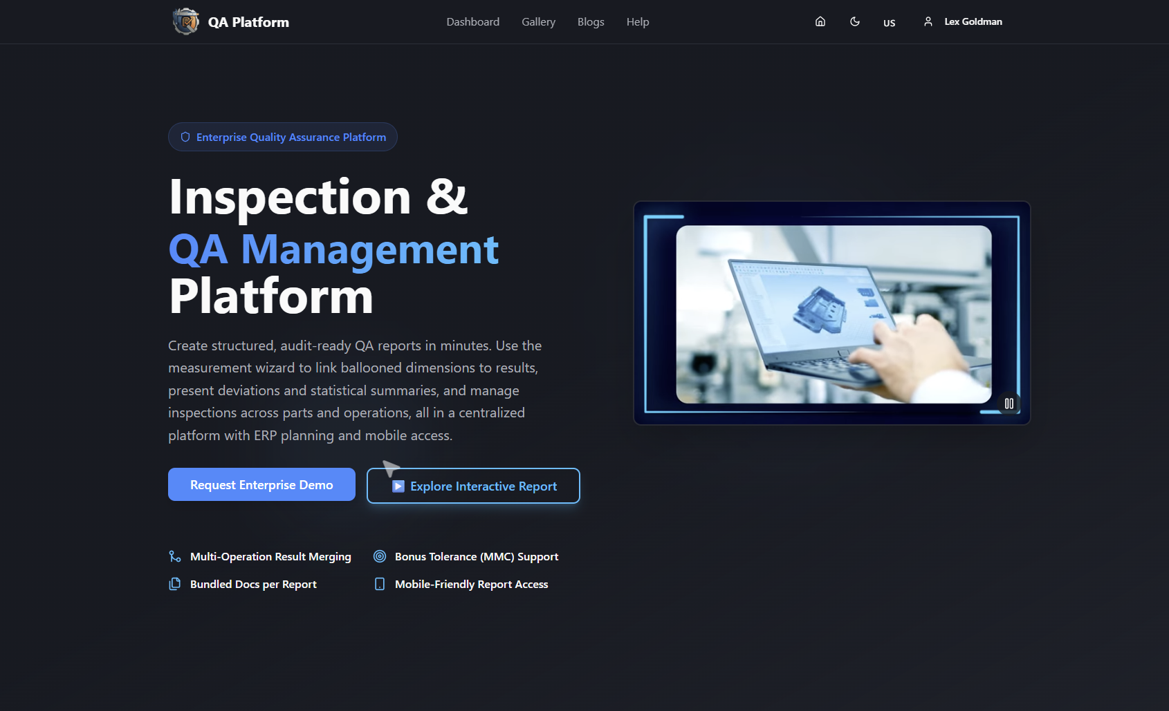
The platform handles the parts of KPI tracking that eat the most engineering time: automatic drawing ballooning, CMM data import, out-of-tolerance flagging, and audit-ready FAI reports built for ISO 9001, AS9100, and PPAP submissions. The MES layer adds route cards and rejection tracking, so rework events feed directly into the RTY and scrap calculations covered earlier, instead of living in a separate system nobody reconciles.
If you're still ballooning drawings by hand, start with the free drawing ballooning tool to see how much setup time it saves on your next first article inspection, or explore the full platform at Qa-report to see how inspection data connects to your quality dashboard end to end.
Sources
The formulas, benchmark ranges, and dashboard guidance in this article draw on a handful of resources worth bookmarking: